
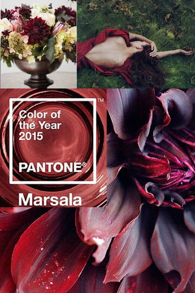

Have you seen the Pantone Colour of the Year? It is MARSALA, a deep, rich, earthy wine colour with warm undertones. It is named after a fortified wine. Do I like it? Yes! Much better than Radiant Orchid for 2014 which was much more limiting.
Pantone has been the global authority on colour for 50 years so they know a thing or two about it! They chart colour direction and study how colour influences us. They have a big influence on colour being used in all aspects of home décor, fashion, marketing and industry.
Marsala…I have a blazer and a turtleneck sweater that colour that I’ve owned for years. They are favourites. To quote Leatrice Eiseman, Executive Director of Pantone Color Institute, “Marsala enriches our mind, body and soul, exuding confidence and stability. Marsala is a subtly seductive shade, one that draws us in to its embracing warmth.”
I like that Marsala, although a fairly dark colour, will combine well with both neutrals and lots of other colours. I can see it in a kitchen or diningroom, red tones promote appetite! I know that both men and women like this shade and something similar has been popular in the past.
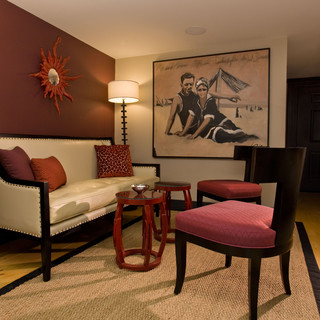
What makes a colour look new is how we use it. Marsala will be beautiful as a layered colour with bronzes and browns. It is dramatic and spicy with neutrals. Complementary colours like teal or turquoise will give it a wow effect, not using them in equal amounts, of course. Can you imagine a soft, pretty blue with Marsala?
There are lots of paint companies and colour experts who also predict colour trends. They are choosing happy, vibrant colours. Bold Coral Reef (I love coral tones!) Blue Paisley, a saturated colour, mellow Guilford Green (Benjamin Moore’s top colour for 2015)
I am seeing deep classic blues continuing to be strong. Maria Killam, a Canadian colour expert, is predicting Olive Green (used judiciously) and the continuation of the trend to gold metallic. About black, Maria says, “This dramatic shade has moved from being an accent colour in the background to the foreground as a main colour”. I have selected an almost black stained cupboard for kitchenettes twice in the past 6 months.
A new year, new colours, new ideas! I can hardly wait! Between Houzz, Pinterest, Facebook and working on my website I feel that I have spent enough time on the computer and excited to get going! I know my readers are checking these sites out too…they are a wonderful resource. If you need help pulling it all together I am just an email or phone call away!
For those of you who are as excited as I am to get started on 2015 decorating projects, I have a promotion on until January 15 for 10 percent savings on a decorating consultation. From me to you!
Basia (Sunday, 04 January 2015 18:00)
Thank you for the info! It's always nice to be updated on what's IN :) I feel in the near future we will be working on our Master Bedroom!
somethingunique (Tuesday, 13 January 2015 16:30)
Thanks Basia. Yes, we all love to know the new trends, even if we decide not to use them! Most importantly, pick what you love and when you are stuck ask for help.
It will be fun to do the Master Bedroom, too often that room gets neglected because it is not a public room. It is easier if you have a piece of art or fabric to inspire the colour scheme. Happy decorating!