
Welcome to my very first blog post! I plan to post new content on a regular basis so come back to visit regularly. If you have questions you would like answered or suggestions for a blog post, please let me know.
I love colour and that is one of the big reasons I became an interior decorator.
This is a huge topic so I will focus on one aspect--creating a harmonious flow of colour from room to room. If you have a feeling that something is not quite right with a space, chances are that a colour choice is the culprit.
So where do we start? I often choose a colour scheme from a fabric or favourite piece of art. In a recent consultation a client insisted on getting her new furniture after re-painting. I typically recommend the opposite. However, we did have a starting point as she had recently painted her living room so the family room, kitchen and hallway all had to flow off of that.
One helpful tip for decorating with colour is using the 60-30-10 Rule. That refers to having 3 colours in a room--60% of a dominant colour, 30% of a secondary colour and 10% of an accent colour. The dominant colour is generally on the walls.
To help create colour flow from room to room it is appealing to play with that ratio. The dominant colour in the living room can become the secondary colour in the dining room or kitchen. You keep the same colours, possibly changing the darkness or lightness of them, but switch up which one is dominant, secondary and accent.
Its a fun and helpful way to create unity and flow without being boring! Accessorizing with a bold accent colour keeps the decor fresh and exciting even though its only 10% of the colour in the room.
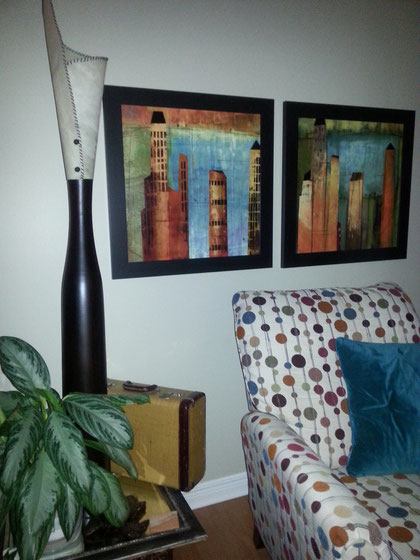
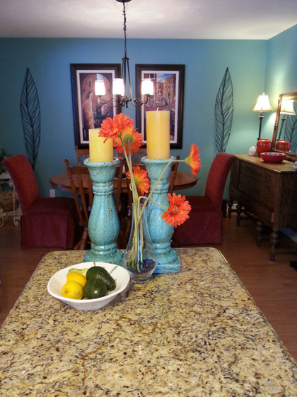
These 2 pictures are taken from the same home. The colour scheme was taken from both the chair fabric and the artwork in the living room. The turquoise colour in the art is used as the accent colour in the living room but is the dominant colour in the adjacent dining area off the kitchen. The gold, rust and turquoise tones are repeated through the surrounding areas in different degrees providing colour harmony and flow.
Contact me if you have your own colour questions!
There are no comments yet.